
Scarecrow Video Website
SCHOOL OF VISUAL CONCEPTS: CAPSTONE
BACKGROUND
"Scarecrow Video is a nonprofit organization dedicated to providing access to the world’s largest publicly available film and television library (132,000 titles), and contributes educational and culturally relevant programming to the community. Scarecrow Video became a non-profit in 2014." Scarecrow recently celebrated their 30th anniversary as an institution and landmark. Brand Statement: "Uniting People with Film"
CONTRIBUTIONS:
User Interface, UI & Visual Design
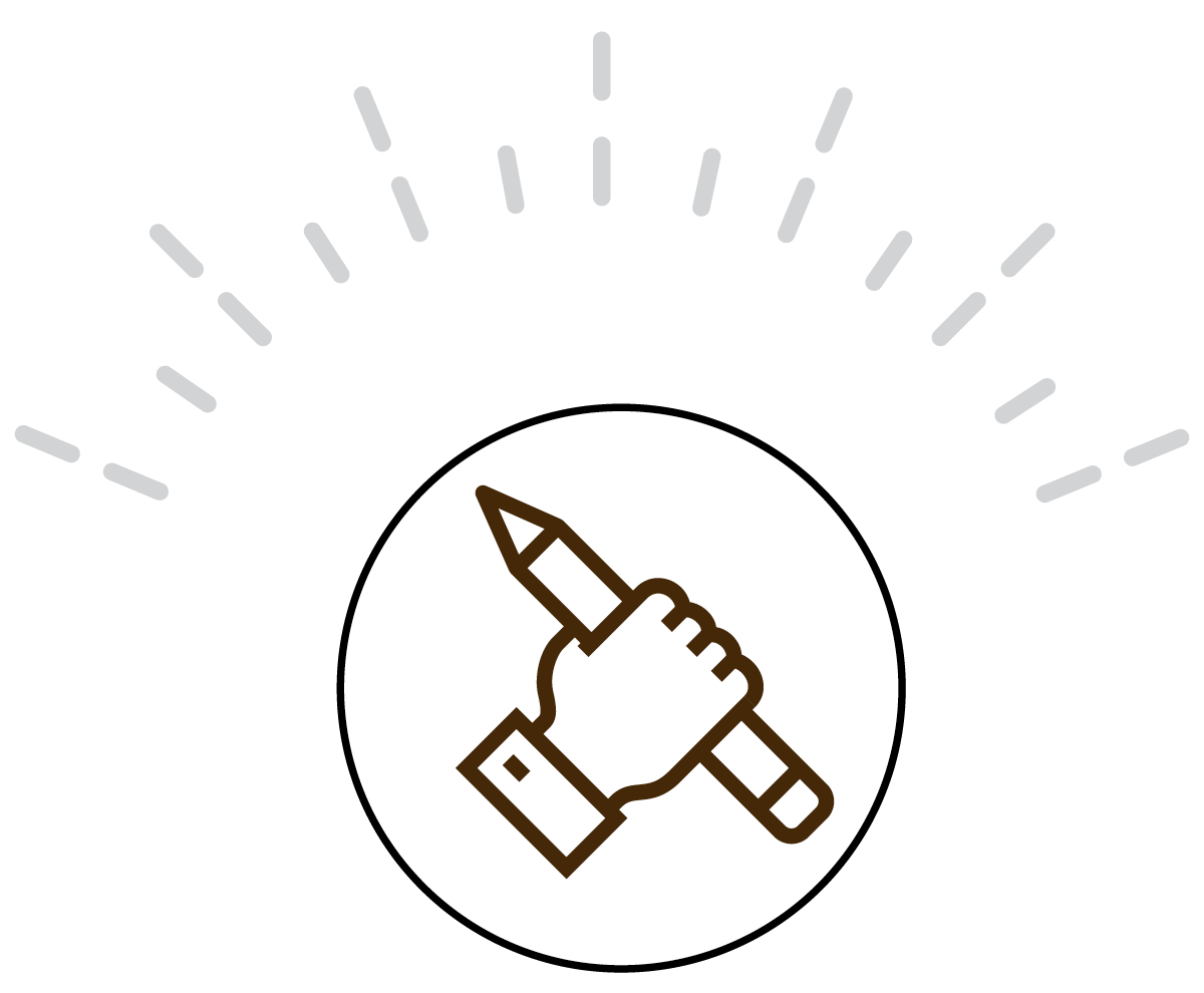
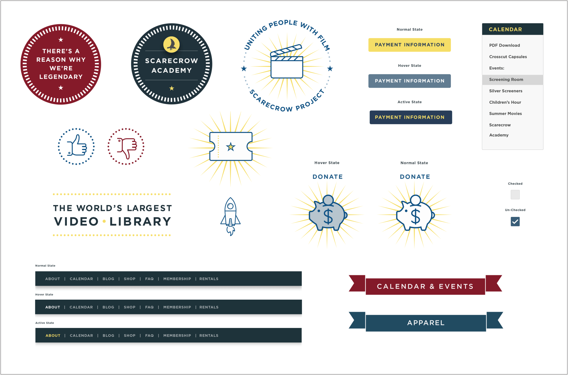
Visual Design Language System
Visual & UX Research
Branding Update
TOOLS:
Sketch, InVision, Illustrator, Photoshop

PROJECT GOALS
Get the message out there!
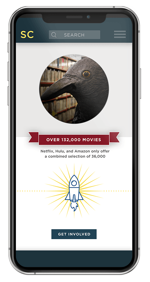
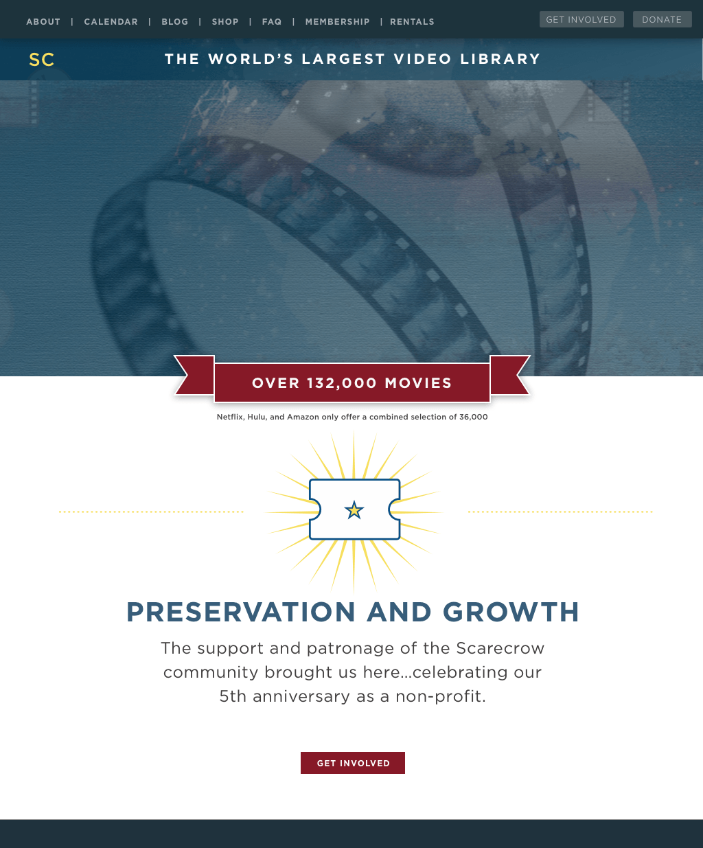
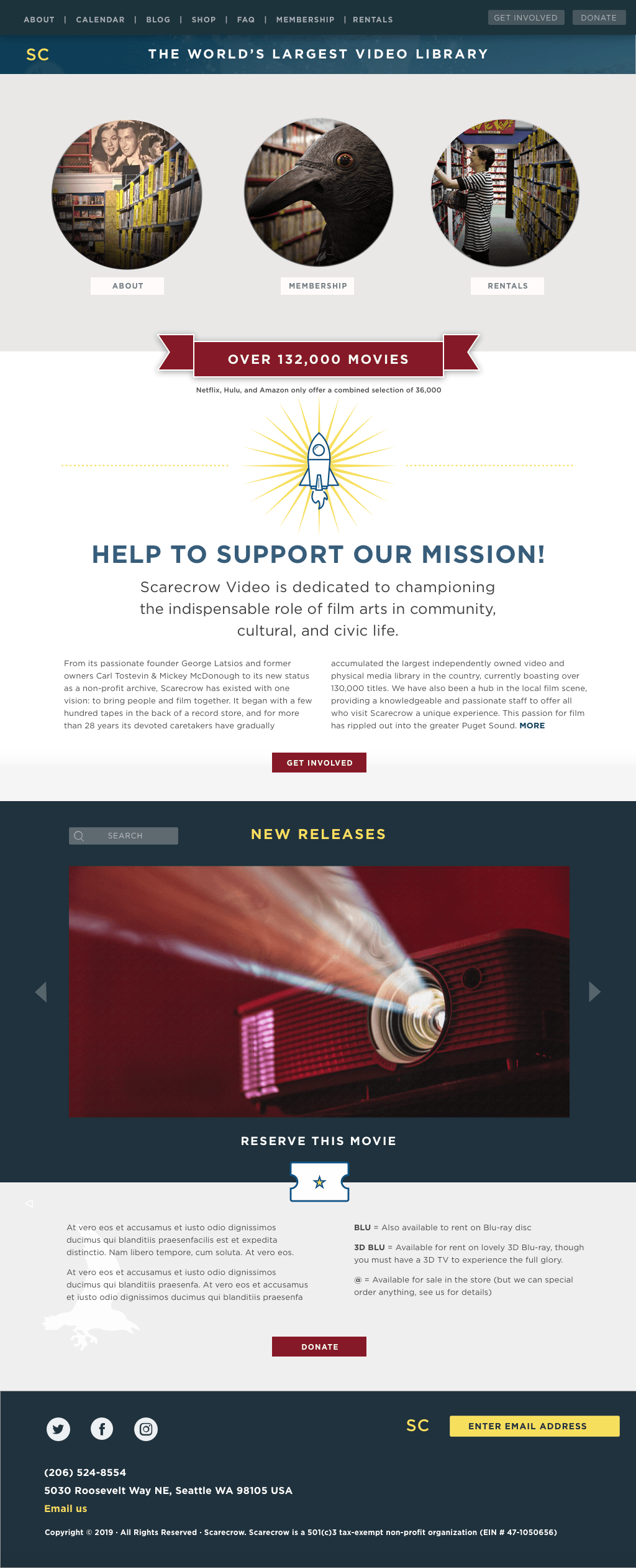
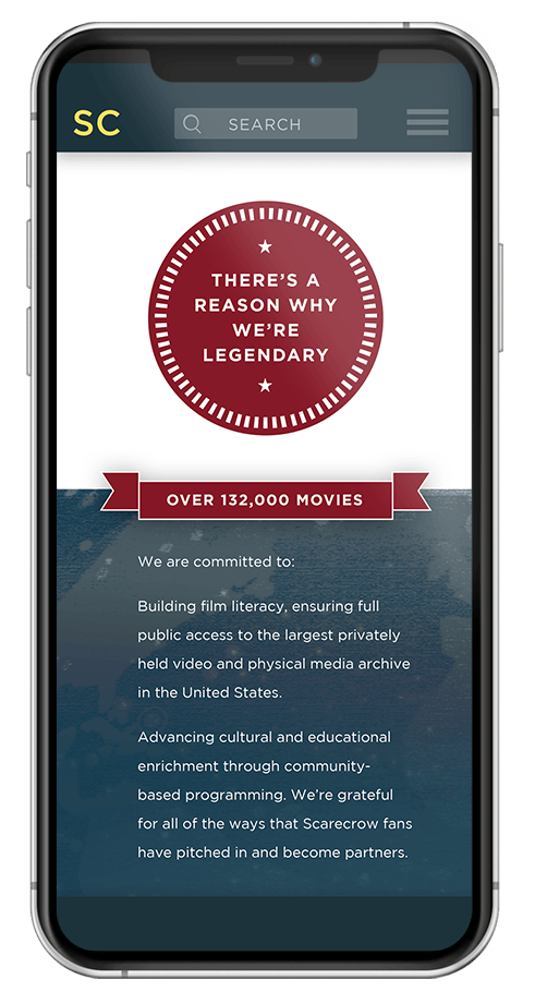
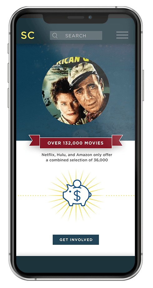
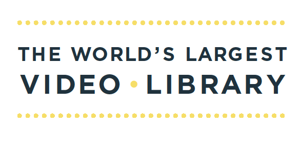
Are you ready for this? Scarecrow Video has the world's largest video library that includes over 132,000 videos. Truly incredible! Netflix, Hulu and Amazon together only have a combined collection of 36,000 movies. I created the typographic image (above) that becomes the primary focus on the homepage, bringing attention to this key message.
Create a site that better conveys that Scarecrow is a nonprofit.
They have had this status for only the last five years but there is still a very low awareness of this. By highlighting three primary areas of focus on the donations page, the user can see where the funding is being directed. I have also used icons on each page, directing users to the donations page.
Update the aesthetics and look-and-feel of the site.
If the website looks old, it reinforces the notion that being in the video/DVD business, Scarecrow must be out of step with the times. I have created a fresh playful visual system and integrated it into a more streamlined user interface design.

USER RESEARCH

VISIT TO SCARECROW VIDEO
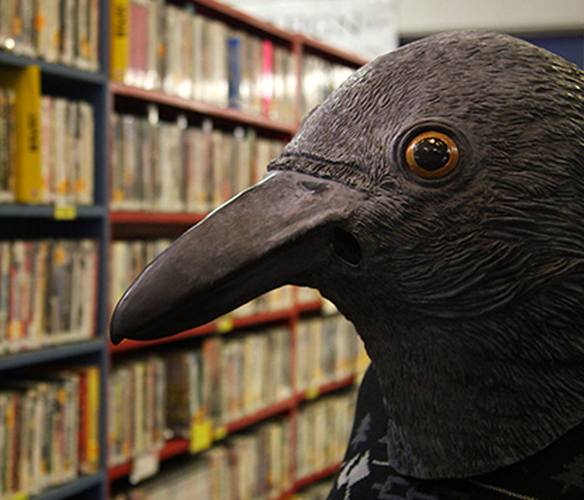
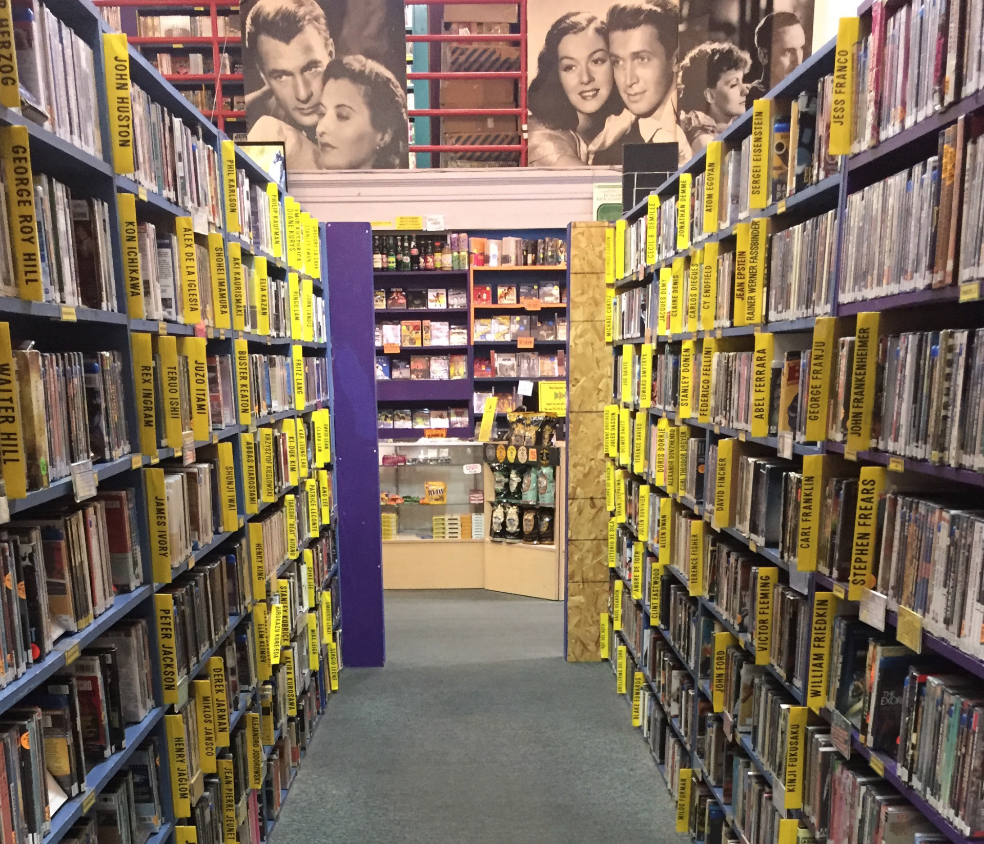
A visit to the Scarecrow Video store allowed me to experience the film arts community and see the dedication of it’s staff and clientele. The store has an eclectic architecture that enhances the browsing experience. I perused the vast number of selections in every movie and film genre imaginable. My Sunday afternoon visit also allowed me to experience one of their onsite community-building events—a movie presentation at their in-store theater.

VISUAL CONCEPTS • MOOD BOARD
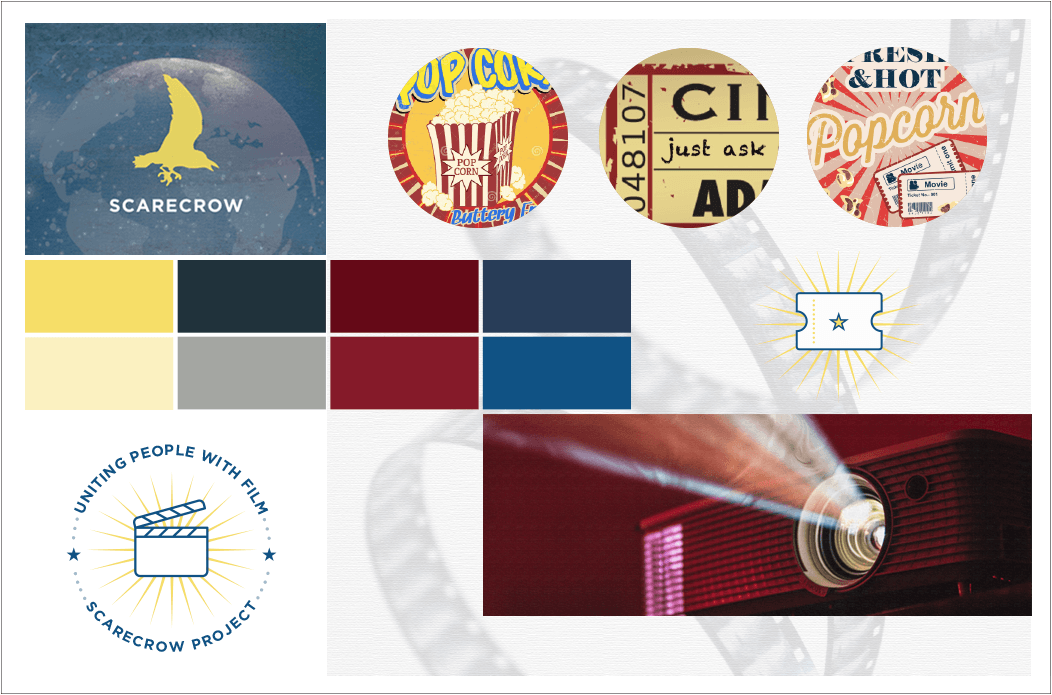
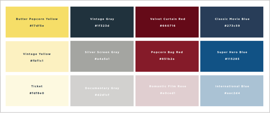
THE INSPIRATION
Colors were inspired by classic movie images and vintage film styles. The color scheme was inspired by images of popcorn bags and movie tickets. "Uniting People with Film" was a core message that worked well as a stand-alone icon. The update includes clean, modern, fun icons.
SITEMAP
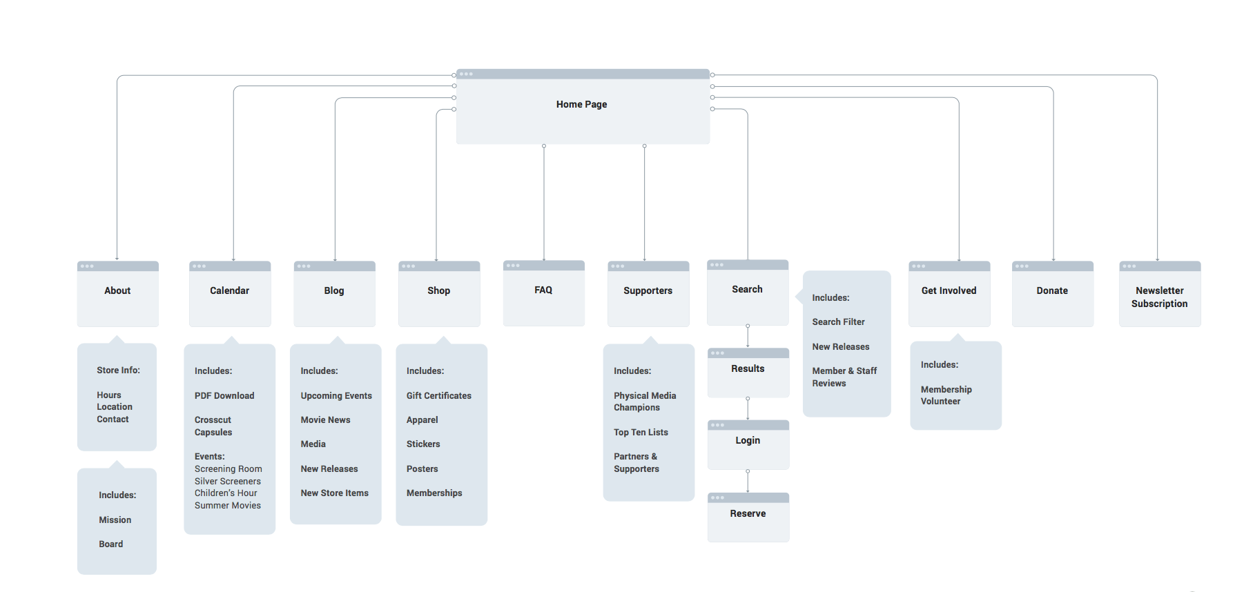
The current Scarecrow Video website is very difficult to navigate. The hierarchy is very confusing. The website also falls short in truly communicating the value of historic preservation of films on video. In order to begin the organizational process, I developed a site map to share with the clients.
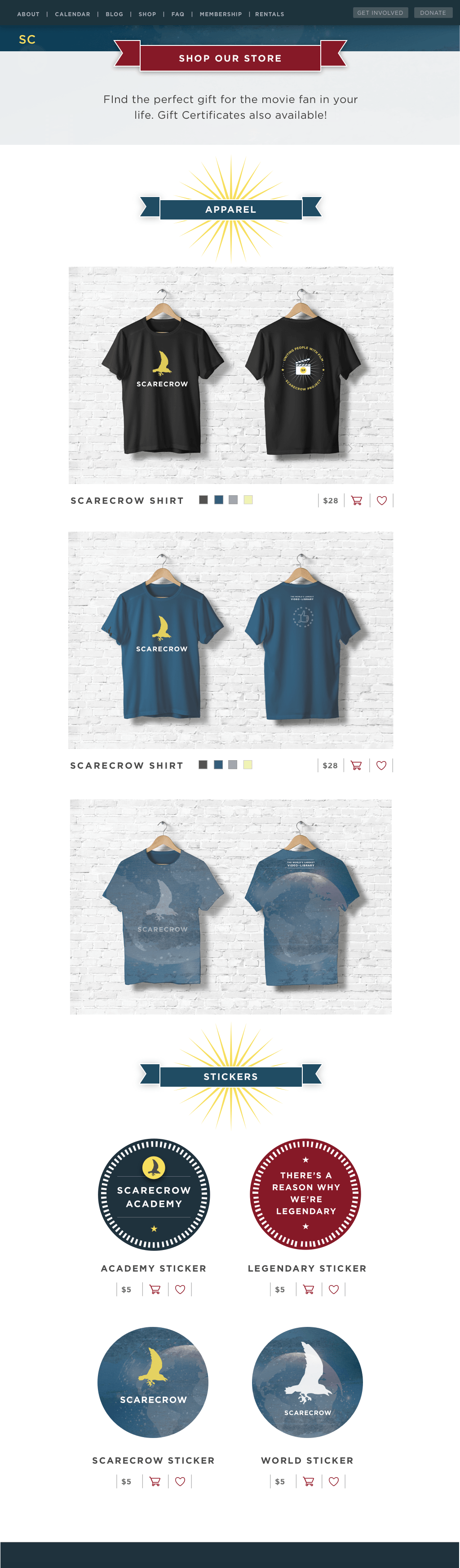
SCARESCROW STORE
Scarecrow Video currently has a store, but it gets lost in the rest of the website. Creating a stronger brand around the store could help promote a sense of community by selling shirts and stickers, as well as providing an opportunity to generate additional revenue.
VISUAL LANGUAGE DESIGN SYSTEMS
<
BACK | NEXT PROJECT
>